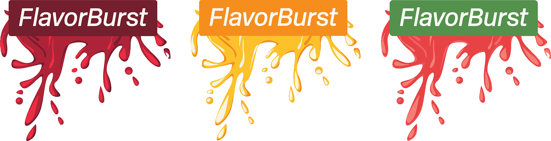
Logo Design
The FlavorBurst logo features vibrant color palettes representing each flavor, with a dynamic splash of flavor and color at its center. This energetic design perfectly aligns with the brand's tagline, "Burst into Freshness," symbolizing the explosive, refreshing sensation each toothpaste delivers. The logo visually conveys the essence of freshness and bold flavor variety.
Triple treat for your teeth!
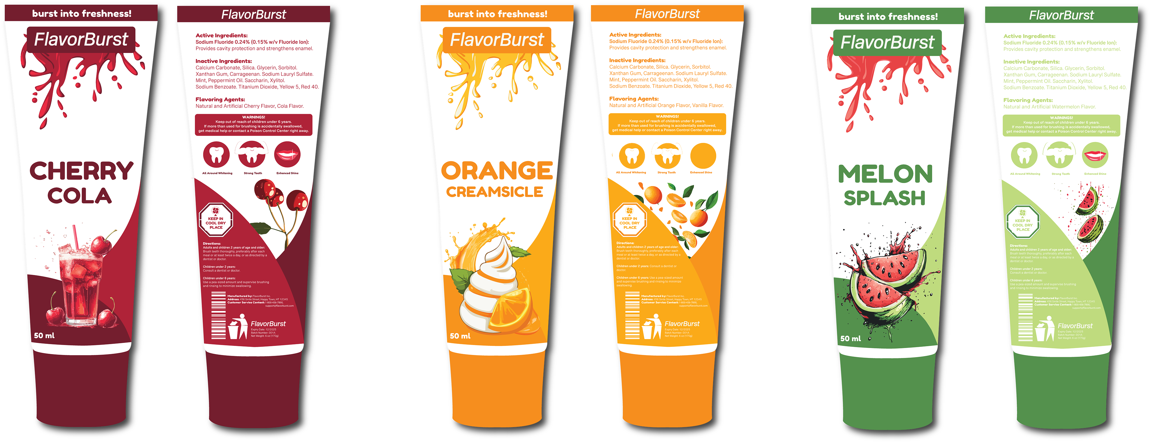
Stylescape Design
The stylescape designed for FlavorBurst showcases three vibrant toothpaste flavors—Orange Creamsicle, Melon Splash, and Cherry Cola—with packaging that reflects each flavor’s bold, playful identity. Key elements like bright color palettes, dynamic typography, and custom flavor-inspired icons create a cohesive visual language. The stylescape also includes UI design concepts for a seamless and engaging online experience. By uniting packaging, branding, and digital aesthetics, the stylescape serves as a visual guide, ensuring FlavorBurst's identity remains consistent across all platforms, helping differentiate the brand in the market.

Advertisement Campaign
Discover the vibrant world of FlavorBurst toothpaste with exciting flavors. The bold, colorful packaging grabs attention, while the fun, playful design mirrors the brand's dynamic identity. Eye-catching typography and flavor-inspired visuals reflect FlavorBurst’s commitment to making oral care enjoyable, blending aesthetics and functionality to create a delightful brushing experience every day.

Brand Motion Design
The motion graphic takes viewers on a vibrant journey through the exciting flavors of FlavorBurst—from Orange Creamsicle to Cherry Cola. Playful animations and swirling colors bring the product to life, highlighting the fun and innovative approach to oral care. With dynamic transitions and typography, the motion graphic reinforces FlavorBurst’s mission to make brushing a delightful, flavorful experience.